STOP making boring presentations

Presentations can often be the bane of our lives and we all know what it’s like to sit through an uninspired, boring, drawn-out presentation but I also guarantee we also know what it’s like to deliver one too. We often make those same exact mistakes, however critical and aware we are of other’s flawed presentations. Whether it’s through lack of confidence, ignoring the small details or having an unengaging structure, let’s look at ways to not bore your audience to tears.
Engage through emotion
However data heavy or analytical your presentation may be, sprinkling some emotive language throughout can go a long way. Opening with a relatable story is a logical first step, but you can also make analogies alongside delivering data to make things more meaningful. Constantly ask yourself why; why does this matter and who does this affect. Grounding your ideas with emotional texture will help your audience relate and gain their support.
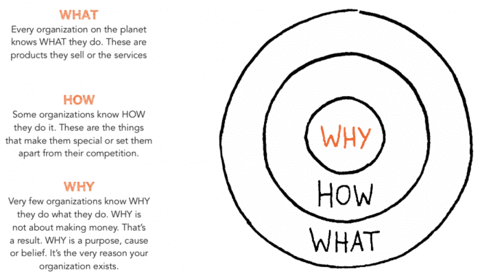
Author and inspiration speaker Simon Sinek created a model called The Golden Circle, where he explains everyone knows WHAT they do, some know HOW they do it but few know WHY they do what they do. If you can answer that pinnacle ‘why’, you are guaranteed to connect with your audience.

Aesthetics are more important than you may think
You may think the way you dress is more important than how your presentation looks, but they are equally as important. Having a sloppy looking presentation is not only ghastly for your audience to look at, but it also says a lot about how much you care. Pay attention to details, don’t over bloat your slides with text that doesn’t need to be there and have fun creating the presentation. Putting as much care into the way your presentation looks, as you do into your ideas will show, and it will excite your audience too.
This doesn’t mean you have to make your presentations too flashy, because garish colours, redundant animations and inappropriate font styles can also be detrimental. The most effective presentations are concise, consistent and understand their audience through their visual style. Don’t be afraid to embrace the negative space too, slides cluttered with text and images can hinder your audiences understanding.
Be unpredictable with your visuals
Before wowing your audience with your witty and unpredictable image choices, you firstly need to make sure these are high quality images. Using pixelated blurry image that the audience can barely make out is a sure way to appear unprofessional.
Now about being unpredictable, there’s nothing else that gets the eyes glazing over like cliché images! Generally you want to avoid going with the first image choice that comes to mind because we guarantee that will be the first image everyone else chooses too, and you want your presentation to stand out amongst the rest. By brainstorming visual concepts, you can think of ways to be original. Instead of using a generic disparaging picture of someone looking stressed out on a presentation about productivity and procrastination, by not use an image of an angry squiggly monster (the procrastination monster we’ll call it!). Much like Tim Ubran did in his hilariously witty Ted Talk, Inside the Mind of a Master Procrastinator (2016). Which can be found here

Using visuals like these can be a great use of Pattern Interrupts, just when things start getting a little samey, you can misdirect your audience, build some tension, and regain their attention… And if you are lucky you might even get a laugh too! Don’t get too carried away however, only use these when appropriate and make sure it doesn’t distract from the delivery of your ideas and data. Even if they are unpredictable, ensure they are still relevant and contribute to your ideas/themes.
Metaphors, metaphors, metaphors
Visual metaphors are not the only way to push past the obvious, using verbal metaphors are an excellent way to bring fresh ideas to the table and capture your audience’s imagination. They can help your audience imagine the intangible and give them something to relate to. Metaphors are used by companies and politicians alike to add persuasive context to points they want to make or to convey relatability. “Knowledge is light” or “procrastination is a thief of time” for example. Try incorporating metaphors into your next presentation to help visualise, add relevance and make unique comparisons of your most unimageable ideas.
Need help brushing up on your presentation skills? Why not join our Online Public Speaking Course
Whether you want to learn how to engage with your audience on new levels or how to structure your presentations in the most dynamic way, why not register for our Online Public Speaking and Advanced Presentation Skills Course. We cover all aspects of presenting from defining your purpose, connecting with your audience to building your confidence and how handle things going wrong. These are all explored through theory-based techniques and models, much like Simon Sinek’s The Golden Circle and we look at brilliant examples of public and motivational speakers. These computer-based modules will ensure you never deliver a yawn enduring presentation again.

